The explanation about the characteristic of ink-jet print paper by the master of paper
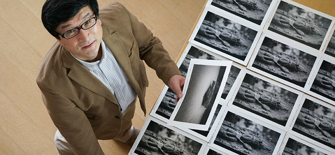
These days many kinds of printing paper for ink-jet printer are sold. With glossy paper or semi-glossy paper, you can print what you see on the display screen if it is appropriately adjusted. But some paper like matte paper or cotton paper, the gradation of deep shadow part tends to be smudged. When it comes to Japanese traditional washi paper, it is much harder to show the density of black ink and usually decreases the contrast more than matte paper. Since the quality of printing is influenced by the texture, ink-jet printing is more difficult to use.
Here, I examined the characteristic of each paper and summarized their character, usage and evaluations. Additionally, some members of SAMURAI FOTO gave their impressions of the usage of paper.
I hope these information will help photographers who aim to achieve wide success in the field.

Koji Murata
He has been involved with development of photographic display at a major Japanese electric appliance maker for many years. He also works on the development of software which simulates display properties of printing paper on display screen.
As one of the member of SAMURAI FOTO, he makes his own artworks and studies the latest characteristic of printing paper. From his study he understands each paper has its own character. He gives seminars or study sessions to show how to use it thoughtfully.
About the value of evaluation standards
1. The impression of whiteness tone of paper and the fluorescent whitening agent.
When you want to express your photographs in warm hue, using yellowish-white paper would be better. If you want your photographs to make cool image, bluish coloring paper would match.
It is difficult to use paper which contains green/magenta color because it negatively affects on color development.
In art printing, the tendency is to avoid using fluorescent whitening agent paper. Because it sometimes looks different from its real color due to the light source. Moreover bleaching effect fades in several years and the paper begins yellowing.
Paper whiteness that is close to neutral (b*=0~3 approx.) is evaluated as point 5. When the paper is too blue or yellowish, it gets 1 point.
Even though it doesn't mean the work is good or bad. You decide the color of the paper just for the theme of your photographs.
However, it will be deducted the point depending on the degree if the paper has a color bias of green/magenta or the fluorescent whitening is used.
2. Feeling(image quality or texture)
The quality and texture of paper has a great affect how the photograph looks like for photo-printing. Here, it is evaluated how the paper makes a good use of any kinds of photographic imagery in various ways and is subjectively evaluated in a five-point scale.
Even if you get a good evaluation about the paper that you use, it doesn't necessarily mean that your art work gets higher points. The important thing is if the paper is used innocuously in various ways.
If you want to know whether you chose the right paper for heightening your art work, it is needed to see from a different point of view, and your concept of your work is greatly related.
You don't need to get too serious about the evaluation about the paper but refer to the comment.
3. Gradation, black tones, and easy control of shadow.
Highlights in every photograph are almost stable and it doesn't make much difference in each kind of paper. Although when it comes to expressing gradation and black tones in the picture, it gives a great different impression as which paper you use. It also varies from printer to printer.
The level of ease in controlling the darkness is ranked in the terms of the beauty of gradations and black tones on a scale of one to five.
4. Resolution image
According to paper, the outline is expressed sharply or softly. Here, sharpness in the photograph is evaluated in five phases.
5. Color
Some paper can describe a highly color saturation and some can't. You need to choose paper carefully. The color saturation expression will be evaluated in five phases.
How to read L*a*b*graph
【 graph L* 】
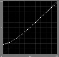
This graph expresses numerically how bright the each gradation is when the photograph is printed on the paper.
The horizontal axis shows original image of each gradation (brightness from 0[black] to 100[white]), and the vertical axis shows gradation printing development power.
When you print out a black image with the digit 0 on the horizontal axis and the digit 20 on the vertical axis, the print image will not be shown jet black (L*=0), but it will be turned out to be grayish (L*=20).
【 graph a* 】
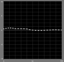
This graph expresses a degree how neutral gray dyes over green or magenta are on the paper. The horizontal axis also shows original image of each gradation (brightness from 0[black] to 100[white]).
When a* goes positive value, gray color is partial to magenta and when it goes negative value, it means the gray color is partial to green. Basically it is easier to use when the numerical value of a* is close to the digit 0.
【 graph b* 】
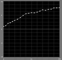
This graph expresses a degree how neutral gray partials to yellow or blue on the paper. The horizontal axis also shows original image of each gradation (brightness from 0[black] to 100[white]). When b* goes positive value, gray color is partial to yellow and when it goes negative value, it means the gray color is partial to blue. b* is greatly influenced by white paper. The gradation goes brighter, the quantity of ink reduces. So the paper ground will expose. Therefore, the numerical value is positive when you use yellowish-white paper and it is negative when you use bluish-white paper.
The measurement of saturation (HSB color system)
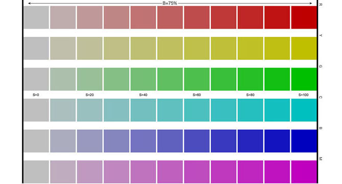
This chart (sRGB) shows the variation with saturation from 0% to 100% (10% each) about the brightness of 75% in the original color (R, G, B, C, M, Y) and measured the printing result of saturation as reference number.
(Output condition)
Printer: Epson PX-5V, using ICC profile that is made with X-rite i1iSis/i1Profiler
Matching method: printing out with relative color gamut maintain
彩度の測定2(HSB表色系)
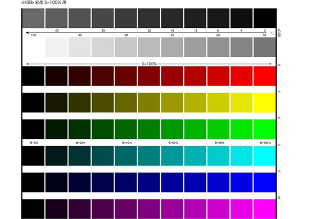
彩度100%の原色(R,G,B,C,M,Y)について、明度を0~100%(10%毎)で変化させたチャート(sRGB)をプリント出力し、印刷結果の彩度(および参考値として明度変化)を測定しています。
(出力条件)
プリンター:エプソンSC-PX3V、X-rite i1iSis/i1Profilerで作成したICCプロファイルを使用
マッチング方法:「知覚的」で出力
彩度の測定3(HSB表色系)
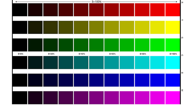
エプソンSC-PX3Vでの測定からは、彩度100%の原色(R, G, B, C, M, Y)について、明度を0~100%(10%毎)で変化させたチャート(上図、sRGB)をプリント出力し、印刷結果の彩度(および参考値として明度変化)を測定しています。
(出力条件)
プリンター:エプソンSC-PX3V、X-rite i1iSis/i1Profilerで作成したICCプロファイルを使用
マッチング方法:「相対的」で出力
How to read saturation graph
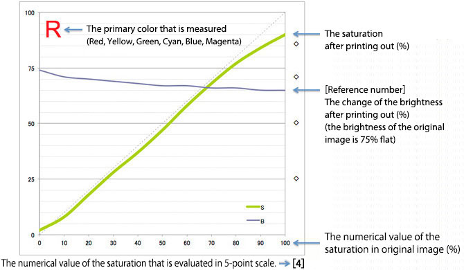
彩度グラフの見方2
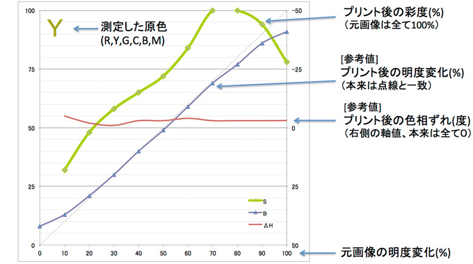
彩度グラフの見方3
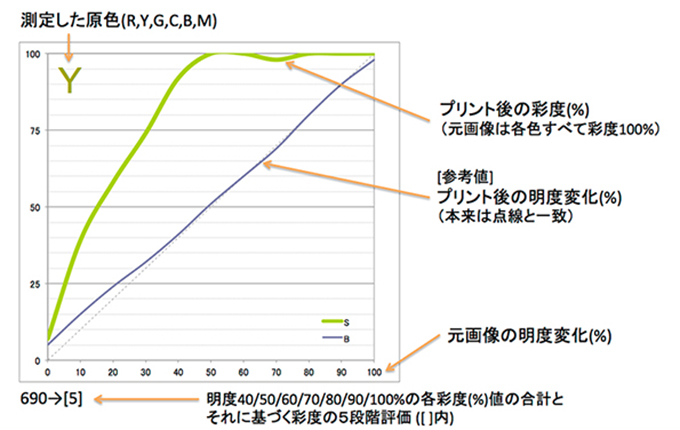
Criteria of saturation
| 5 | 4 | 3 | 2 | 1 | |
|---|---|---|---|---|---|
| R | 100~85% | 84~70% | 69~50% | 49~25% | 24~0% |
| Y | 100~85% | 84~70% | 69~50% | 49~25% | 24~0% |
| G | 100~85% | 84~70% | 69~50% | 49~25% | 24~0% |
| C | 100~70% | 69~60% | 59~50% | 49~25% | 24~0% |
| B | 100~85% | 84~70% | 69~50% | 49~25% | 24~0% |
| M | 100~70% | 69~60% | 59~50% | 49~25% | 24~0% |
※ The saturation of the original image is seen as 100%. We see the numerical value of the saturation of the print and evaluated every six colors. We see the average point as the comprehensive evaluation of coloring. (the number of decimal places is rounded off.)
Criteria of saturation 2
| 5 | 4 | 3 | 2 | 1 | |
|---|---|---|---|---|---|
| R | 700~500% | 499~430% | 429~370% | 369~300% | 299~0% |
| Y | 700~600% | 599~500% | 499~450% | 449~400% | 399~0% |
| G | 700~500% | 499~430% | 429~370% | 369~300% | 299~0% |
| C | 700~450% | 449~400% | 399~350% | 349~300% | 299~0% |
| B | 700~600% | 599~450% | 449~350% | 349~250% | 249~0% |
| M | 700~450% | 449~350% | 349~270% | 269~200% | 199~0% |
※ 上記6色毎に明度40/50/60/70/80/90/100%の各彩度(%)値を合計して色ごとの評点を算出し、6色の評点の平均点(小数以下四捨五入)を「発色」の総合評価点数としています。(700点満点)

