About paper Awagami Factory Premio KOZO white paper
【Feature of paper】
Premio KOZO white paper is placed as one of the highest quality level of inkjet paper series in Awagami factory, as is called A.I.J.P., of which name premio means premium. KOZO is one of the most representative materials of washi.
By putting another material paper on the backside of the machine-made KOZO paper, it gets thicker. Therefore it succeeded to express prefund feeling when you have in hand and also make it easy to use as a printing paper.
The thickness of the paper is 0.35mm. Comparing to another basic products of Awagami Factory; 'KOZO(Thick white)/0.23mm', 'KOZO(Thin white)/0.16mm', and 'KOZO dual paper/0.18mm', this paper has a good texture. It is difficult to have show-through, so it is both easy to print and remove a show-through when you frame the printing.
From its neutrality, I chose this washi. It also doesn't contain fluorescent whitening agent. The neutral paper has a good keeping quality and doesn't vary across the ages. Using no-fluorescent-whitening-agent paper is preferable as the secular change as well.
If you have a good reason to use a Japanese traditional washi paper as a printing paper, it would be one of the persuasive ways to show the strength of your artwork. 'Premio KOZO' will help you to make your photograph be superior.
It can be mentioned as a whole paper of Awagami factory, they have originally coating on the surface of the paper.
Since it is suitable for ink jet printer, it successfully expresses better density in the gradation characteristic. It also can finish with high quality of hue and contrast as you expect.
【important points】
Pigment ink should be used basically. For black, I recommend to use a matte black ink for washi.
It can be said in general for washi, you feel rough the surface of the paper and ink spreads a bit because of the fiber of washi. The important thing is that you don't need to take those points that I mention above negatively but try to maximize the effect of washi.
As washi can express black tone as much as a matte paper, it is possible to have a similar contrast feeling with matte paper but can express different mood.
Compared to the matte paper, however, the saturation such as blue or magenta doesn't increase that much. It is a better way not to try to increase the saturation of those colors at least. If you are particular about the saturation, you shouldn't choose washi in the first place.
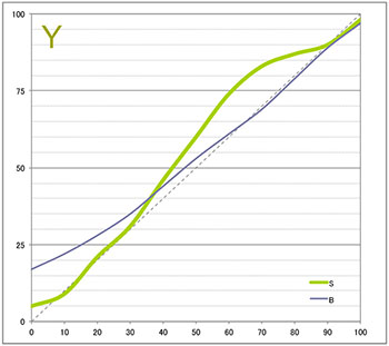
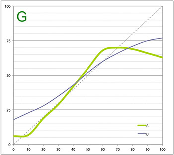
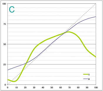
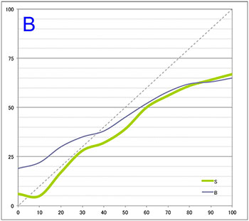
As for Epson PV-5V printer, color of green/magenta has no bias even in monochrome mode that means the characteristic is honest. Therefore I can say that using this printer is one of the good ways for printing on washi paper.
It can be said for paper from Awagami factory that in general, as the surface of the paper is coated, the paper feeding roller doesn't go smoothly. It sometimes may get stuck going through the printer. To avoid this problem, clean the paper feeding roller frequently or feed the paper manually.
【color mode】(ICC profile perceptually-evaluated)
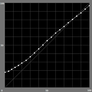
L*
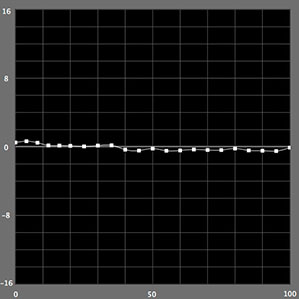
a*
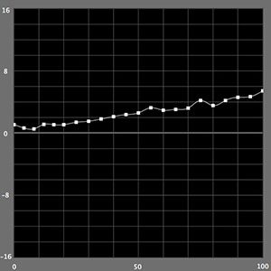
b*
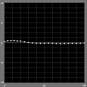
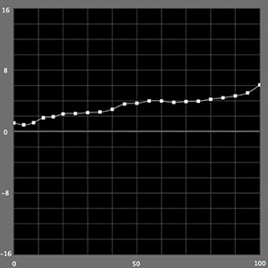
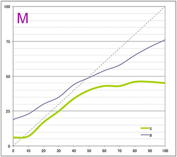
- The gradation characteristic in L* shows that black tone appears darker as a washi paper.
- a* has no bias in particular.
- b*has a honest characteristic to the whiteness.
Printer : Epson PX-5V, Matte black ink, in set UltraSmooth Fine Paper (super high-definition)
Profile : X-rits i1Profiler/i1iSis
【monochrome mode】(Epson PX-5V)
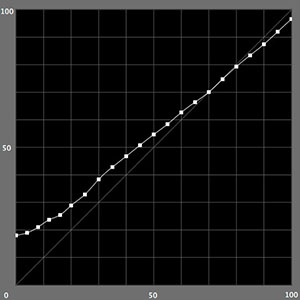
L*
a*
b*
- The gradation characteristic in of L* is standard. The blackness is shown well.
- It is easy to use in monochrome mode because a* has no color bias.
Printer: Epson PX-5V, Matte black ink, in set UltraSmooth Fine Paper (super high-definition)
【Paper texture and the color of printing】
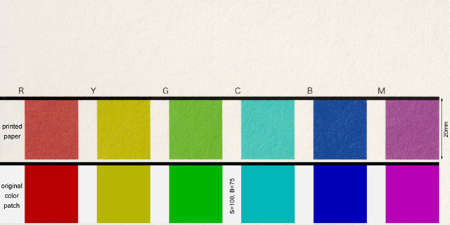
【The saturation and changing brightness after printing】
Awagami Premio Kozo (Epson SC-PX3V)
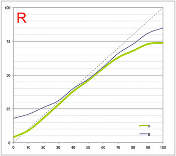
417→[3]
[Reference]Glossy paper (Epson SC-PX3V)
![[Reference]Glossy paper (Epson SC-PX3V) RED [Reference]Glossy paper (Epson SC-PX3V) RED](img/premio/3v_Ref-Koutakushi_1R.jpg)
The saturation of red isn't so high but it has a higher level for washi.
Awagami Premio Kozo (Epson SC-PX3V)
538→[4]
[Reference]Glossy paper (Epson SC-PX3V)
![[Reference]Glossy paper (Epson SC-PX3V) YELLOW [Reference]Glossy paper (Epson SC-PX3V) YELLOW](img/premio/3v_Ref-Koutakushi_2Y.jpg)
The saturation of yellow develops vividly like a glossy paper.
Awagami Premio Kozo (Epson SC-PX3V)
433→[4]
[Reference]Glossy paper (Epson SC-PX3V)
![[Reference]Glossy paper (Epson SC-PX3V) GREEN [Reference]Glossy paper (Epson SC-PX3V) GREEN](img/premio/3v_Ref-Koutakushi_3G.jpg)
The saturation of green is fairly good for washi.
Awagami Premio Kozo (Epson SC-PX3V)
374→[3]
[Reference]Glossy paper (Epson SC-PX3V)
![[Reference]Glossy paper (Epson SC-PX3V) CYAN [Reference]Glossy paper (Epson SC-PX3V) CYAN](img/premio/3v_Ref-Koutakushi_4C.jpg)
The saturation of cyan isn't high enough but coloring is good.
Awagami Premio Kozo (Epson SC-PX3V)
369→[3]
[Reference]Glossy paper (Epson SC-PX3V)
![[Reference]Glossy paper (Epson SC-PX3V) BLUE [Reference]Glossy paper (Epson SC-PX3V) BLUE](img/premio/3v_Ref-Koutakushi_5B.jpg)
Generally, blue or magenta doesn't develop well on washi and the saturation of those colors aren't so good.
Awagami Premio Kozo (Epson SC-PX3V)
297→[3]
[Reference]Glossy paper (Epson SC-PX3V)
![[Reference]Glossy paper (Epson SC-PX3V) MAGENTA [Reference]Glossy paper (Epson SC-PX3V) MAGENTA](img/premio/3v_Ref-Koutakushi_6M.jpg)
Especially magenta, the saturation doesn't develop well.
The average point of 6 colors = 3.3
Awagami Factory [Premio KOZO]
Impressions of usage the paper by Hiroaki Hasumi
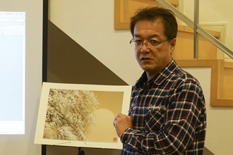
The reason I chose this paper for printing.
The biggest reason is it is a traditional Japanese paper which has 1300 years history. Seeing as I am Japanese, I think it is the right paper for photo-printing to express cherry blossoms, of which Japanese people have adorations for a long time.
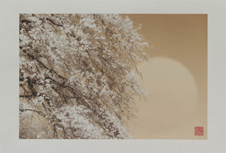
I like the color of the paper. It is good for expressing cherry blossoms' whiteness.
When I express white cherry blossoms in my photograph, the white part becomes the color of the paper itself. In Japanese paintings, people have used chalk, a crushed shell powder for showing whiteness. I wanted to show my photographs like a Japanese painting. And I thought this paper is very close to chalk whitening. A little gritty and shiny white paper is slightly yellowish. The color of the paper gives us a feeling of a long history. I have been searching for the right paper for my artwork, finally I found this paper, Premio KOZO, from Awagami factory.
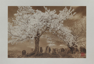
I like the thickness, and the resolution image.
The thickness of the paper is also the big reason I chose it. You see the profound feeling when you have in hand. Many kinds of wahi are thin and because of the thinness, it is see through. And it makes the impression of the photograph change after printing. This paper has enough thickness and I could show my photographs to gallery owners with confidence at the photo folio reviews in Arels, France. Some says that the resolution image of washi isn’t good but you don’t need to worry about it with this paper. The image quality isn’t so rough and it also can show a three-dimensional appearance in the photograph. I say this paper is perfect except for its cost;it is 2,000 yen for 1 sheet.

